A single Notion page can replace 3-4 separate tabs — if it's built correctly. The failure mode of most "Notion trading dashboards" isn't missing features; it's over-engineering. 20 widgets crammed onto one page turn into a slow-loading mess that nobody checks daily. The dashboard that gets used every trading session is the one built around 5 questions, answered by 6-8 carefully-placed widgets, with one clear layout that doesn't require rethinking.
This guide walks through the specific 5-section blueprint that works across trading styles, the 15-minute build process from empty Notion page to working dashboard, the customization matrix for day vs swing vs prop firm vs crypto trading, and — most importantly — the three traps that kill dashboard adoption after the first week of enthusiasm.
Layout recommendations reflect usage patterns from traders running widget-based Notion dashboards over multi-month periods. The 5-section blueprint works because it maps to the 5 questions traders actually check daily (current state, trajectory, patterns, risk, context) rather than aggregating every possible metric. Specific widget names reference the TSB widget library at traderssecondbrain.com/tools — the blueprint structure itself applies to any widget provider's iframe-embeddable library.
Why Build a Dedicated Dashboard Page
Most traders using Notion scatter data across multiple pages — trade log on one, weekly review on another, market notes somewhere else. Every performance check becomes a 3-4-click navigation exercise. A dedicated dashboard page solves this by putting all key metrics and charts in one location, on a page that loads once and serves as a reference throughout the trading day.
The Dashboard Is Not a Replacement for the Journal
The dashboard is a separate, always-current page checked before trading, during trading, and during reviews. It doesn't replace trade-by-trade journaling or review templates — it complements them by providing a fast-glance summary that makes the deeper work more targeted. Think of it as the control panel sitting above the journal engine, not as a competitor to the journal.
The 15-20 Minute Time Investment
Building this dashboard once takes 15-20 minutes. After initial setup, it requires zero ongoing maintenance. Widgets fetch fresh data each page load, the layout persists across Notion sessions, and the structure tends to survive even through significant trading-style changes. The cost is front-loaded; the benefit compounds daily.
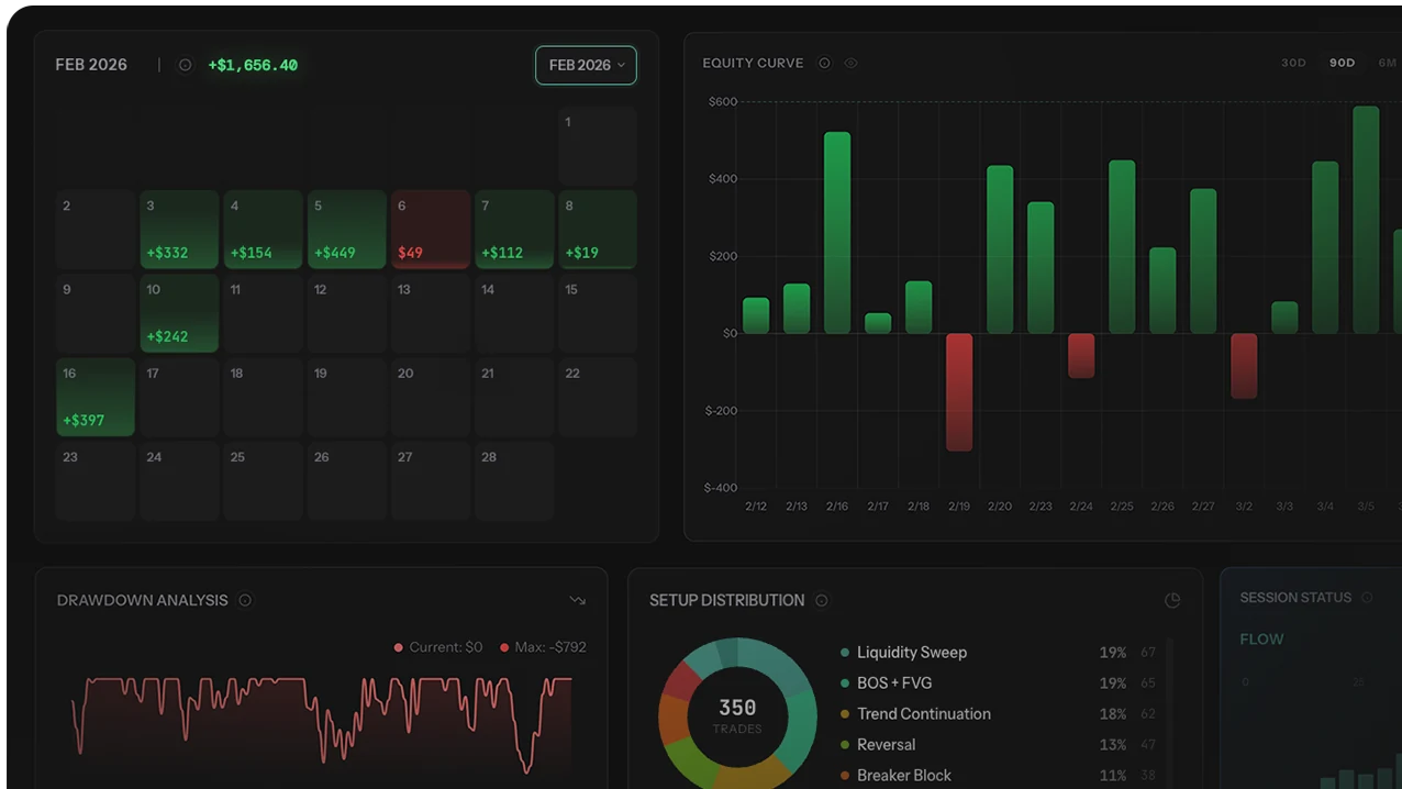
The Dashboard Layout Blueprint (5 Sections, 7 Widgets)
Effective dashboards follow a visual hierarchy. The most important information goes at the top where the eye lands first. Supporting details go below. The structure that works across trading styles:
| Section | Position | Widgets | Purpose |
|---|---|---|---|
| Headline Stats | Top row | P&L Card + Streak Counter | Instant snapshot of current state |
| Performance Charts | Second row | Equity Curve (full width) | Visual trend of account growth |
| Pattern Analysis | Third row | Calendar Heatmap + Win Rate by Day | Identify timing patterns |
| Risk Monitoring | Fourth row | Drawdown Chart (full width) | Track drawdown against limits |
| Market Context | Bottom row | Economic Calendar + Sessions Clock | Today's market environment |
This 5-section layout uses 7 widgets total — within the performance-friendly range for Notion desktop (load times stay under 3 seconds on typical connections). The top-to-bottom flow maps to how traders actually scan a dashboard: current state first, trajectory second, patterns third, risk fourth, market context fifth.
Why 7 Widgets, Not 15
Each embed is a separate network request. Past 8 widgets per page, desktop Notion's load time becomes noticeable (3-5 seconds). On mobile, the ceiling drops to 4-5 widgets before similar degradation. The 7-widget blueprint sits deliberately under both ceilings, giving headroom for one or two added widgets before performance problems emerge.
Why the Top-to-Bottom Order Matters
Visual hierarchy isn't cosmetic. Traders scanning the dashboard in 3-5 seconds before the session starts need the critical data (current state, recent trajectory) at eye-level. Pattern analysis and risk monitoring belong below — they're weekly-review tools, not pre-session tools. Economic calendar at the bottom because it's reference material, not active performance data.
Section 1: Headline Stats
The top of the dashboard should answer one question instantly: how am I doing right now?
The Two-Column Layout
Use Notion's column layout (/columns) to place two widgets side-by-side:
- Left column: P&L Summary Card showing total P&L, win rate, profit factor, and trade count for the current period
- Right column: Streak Counter showing current winning or losing streak and historical bests
Set both widgets to half width and 180-200px height. These are compact data cards, not charts. They should be scannable in under 2 seconds — if you find yourself needing more than a glance, the dashboard is under-delivering its headline function.
Optional Header Context
Add a Notion heading block above this section with today's date (using @Today or a formula property). This gives the page a professional header and confirms the data is current at every page load.
Section 2: Equity Curve
Below the headline stats, embed the equity curve at full page width with 350px height. This is the centerpiece. The equity curve tells the story of the account in one line — upward slope is growth, flat is consolidation, dips are drawdowns.
Configuration Notes
- Use default date range (all-time) for the big picture. For focused views, create a second embed with a date-range parameter showing just the current month.
- If you trade multiple strategies, use the tag filter parameter to show a combined curve on one embed and a per-strategy curve on another side-by-side.
- The equity curve is the widget most traders look at first. Full width and prominent placement isn't optional — it's the single most-referenced data on the dashboard.
Section 3: Pattern Analysis
This section helps spot patterns affecting execution. Two-column layout:
- Left column: Calendar Heatmap (full column width, 280px height). Color-codes every trading day by result. Clusters of red or green reveal streaks and seasonal patterns.
- Right column: Win Rate by Day of Week (full column width, 250px height). Bar chart showing which weekdays consistently under- or over-perform.
These two together answer questions like "am I losing money on Mondays?" or "was the second week of March a bad week?" — questions that require manual tabulation without the visualization. For the analytical framework these widgets support, see the calendar heatmap case study and session filter case study.
Section 4: Risk Monitoring
Embed the drawdown chart at full width with 300px height. This widget plots drawdown from peak equity over time. For prop firm traders, this is the survival metric — the dashboard must show drawdown prominently so dangerous levels register before they hit limits.
Pair Chart With Written Rules
Below the drawdown chart, add a Notion text block listing the current drawdown rules in writing:
- Maximum daily loss limit (e.g., 5% for FTMO)
- Maximum total drawdown limit (e.g., 10% for FTMO)
- Current buffer remaining (calculated from peak to current)
Visual chart plus written rules creates accountability. When the drawdown chart shows approaching limits, the written rules confirm exactly what those limits are without requiring context-switch to another page. For prop firm challenge specifics, see the prop firm rules cheatsheet.
Prop firm challenge traders: If you're in an active challenge, this section is the most critical part of the dashboard. Consider making the drawdown chart taller (400px) so details are easier to read during active trading — an extra 100px of vertical space is worth the legibility improvement when the metric is survival-critical.
Section 5: Market Context
The bottom section provides market-level context using public widgets that require no account. Two-column layout:
- Left column: Economic Calendar at 400px height. Shows upcoming high-impact events with times, previous values, and forecasts. Essential for avoiding news-driven volatility or positioning around announcements.
- Right column: Market Sessions Clock at 250px height. Visual indicator of which sessions are currently active and when the next session opens or closes.
These widgets ensure no trade opens without knowing the market context. High-impact news in 30 minutes? The economic calendar makes it visible. Trading during the London-NY overlap? The sessions clock confirms without leaving the page.
Step-by-Step Build Process (15-20 Minutes)
Follow these steps to build the complete dashboard from an empty Notion page:
- Create a new Notion page. Name it "Trading Dashboard" and set an icon (chart emoji or preferred icon).
- Add a heading. Type "Trading Dashboard" as an H1 at the top. Optionally add a date reference using
@Today. - Build Section 1 (Headline Stats). Type
/columnsand select 2 columns. In the left column, type/embedand paste the P&L Summary Card URL. In the right column, embed the Streak Counter. Resize both to approximately 200px height. - Add a divider. Type
/dividerbetween sections for visual separation. Repeat between every section. - Build Section 2 (Equity Curve). Type
/embed, paste the equity curve URL. Set full width, 350px height. - Build Section 3 (Pattern Analysis). Another 2-column layout. Left column: Calendar Heatmap. Right column: Win Rate by Day.
- Build Section 4 (Risk Monitoring). Full-width embed for the Drawdown Chart. Below it, add a text block with current drawdown rules and buffer calculations.
- Build Section 5 (Market Context). Two columns. Left: Economic Calendar. Right: Market Sessions Clock.
- Verify on every device. Open the dashboard on desktop and on the primary mobile device. Widget rendering can differ between Notion desktop and Notion iOS (WKWebView handles iframes slightly differently). Test before committing.
- Pin the page. Add it to Notion favorites or the sidebar for one-click access.
The entire build takes 15-20 minutes. Most of that time is copying URLs and adjusting widget sizes — the actual Notion work is minimal once the layout plan is clear.
The widget URLs required for this blueprint come from whatever journal tool the trader uses. Free public widgets (Economic Calendar, Market Sessions) are available from multiple providers. Performance widgets require a journal that exposes Notion-embeddable URLs — most journals still force tab-switching rather than supporting direct Notion integration. The trading journal comparison covers which ones support Notion widgets natively versus which require CSV-export workarounds.
Customization by Trading Style
The blueprint above works for most traders, but adapts cleanly to specific styles:
| Trading Style | Add | Remove | Why |
|---|---|---|---|
| Day trader | Session Performance Breakdown | Monthly P&L (less relevant) | Session timing matters more than monthly trends |
| Swing trader | Monthly P&L Bar Chart | Session Clock (less relevant) | Swing traders care about monthly trends, not session timing |
| Prop firm challenge | Second drawdown widget (daily limit) | Win Rate by Day | Drawdown is the survival metric during challenges |
| Multi-strategy | Per-strategy equity curves | Single equity curve | Need to compare strategy performance individually |
| Forex scalper | Forex Rates + Currency Strength | Calendar Heatmap | Real-time rates matter more than daily patterns |
| Crypto trader | Trade Distribution + P&L Summary | Economic Calendar + Sessions | Crypto has no session structure; focus on behavior patterns |
3 Mistakes Dashboard Builders Make
Mistake 1: Building Before Having Data
Performance widgets render user-specific analytics from logged trades. Building a dashboard with performance widgets before importing trades means every widget renders empty or with statistically meaningless data (win rate of 100% on 2 trades, etc). The empty dashboard looks broken, the trader loses enthusiasm, and the dashboard gets abandoned before it has a chance to deliver value. Import at least 30-50 trades first, then build. Empty dashboards don't inspire.
Mistake 2: Not Using Toggle Blocks on Busy Pages
If the dashboard grows past the recommended 7 widgets — even temporarily — wrap the secondary sections in Notion toggle blocks (collapsed by default). This keeps page load time fast because only the top sections load initially. When you need the secondary data, expand the toggle. Without this technique, dashboard performance degrades steadily as widgets get added, and eventually the page becomes too slow to open quickly during active trading.
Mistake 3: Skipping the Mobile Verification Step
Widgets that render perfectly on Notion desktop can show blank frames or broken layouts on Notion iOS — the WKWebView engine handles iframes differently from the desktop app's browser engine. Building a dashboard without opening it on a phone means discovering 30 days later that the mobile experience is broken, at which point remediation means redesigning sections or removing widgets that don't render. Test on mobile during the build, not after.
Who Should Skip Building This Dashboard
Not every trader benefits from a Notion widget dashboard. Specific profiles get limited value:
- Traders with fewer than 50 logged trades. Performance widgets need data to render meaningfully. Build the dashboard after you have enough trades for the metrics to be statistically interpretable — not before.
- Traders who don't already use Notion for trading workflow. Migrating to Notion specifically to build a dashboard means adopting an entire notes/planning system on top of building the dashboard itself. The combined cost usually exceeds the benefit; if Notion isn't already your workflow, try a native dashboard in your journal tool first.
- Mobile-primary traders. Notion mobile (especially iOS) handles widget-heavy pages less gracefully than desktop. If the majority of journaling and review happens on a phone, consider whether a mobile-first journal app provides better dashboard capability than Notion embeds.
- Very high-frequency traders. Scalpers taking 50+ trades per session don't have time to check dashboards between entries. Session-level or post-session review captures value better than real-time dashboard monitoring for this profile.
- Traders whose journal doesn't expose widget URLs. Without widget URLs that can be embedded via Notion's
/embed, the performance widgets portion of this blueprint isn't achievable. Only the public widgets (Economic Calendar, Market Sessions) would work — which is a significantly less complete dashboard.
Advanced Tips for Dashboard Power Users
- Toggle sections for performance. Wrap each dashboard section in a Notion toggle block. Page loads with toggles collapsed, you expand only what you need at the moment. Great for slower connections and for dashboards that grew past 7 widgets.
- Create multiple dashboards per account or strategy. Build separate dashboard pages for different accounts or trading strategies. Duplicate the template page and update widget URLs with different account or tag parameters.
- Link from your journal template. Add a link to the dashboard at the top of your journal template. Every new journal entry has the dashboard one click away.
- Use Notion synced blocks for shared widgets. Notion's synced blocks let you embed a widget once and mirror it across pages. The equity curve on both the dashboard and the weekly review template can be a single synced block, so edits propagate automatically.
- Mix live data with written commentary. Between widget sections, add text blocks with personal commentary: "Goal this month: keep drawdown under 3%" or "Focus on London session setups only." The combination of live data and written context makes the dashboard analytical and actionable.
- Review the dashboard layout monthly. During your monthly review, audit which widgets you actually reference vs which sit ignored. Remove what isn't being used. Promote what gets checked daily.
Final Verdict: Start Small, Iterate Ruthlessly
The best Notion trading dashboard is the smallest one that answers your daily questions consistently. The blueprint above starts at 7 widgets because that's the upper bound of what loads comfortably and the lower bound of what covers the full 5-question framework. Most dashboards trim to 4-5 widgets within the first month as traders audit what they actually reference.
Three principles from this framework:
- 7 widgets is the ceiling, not the target. Dashboards that grow past 8-10 widgets reliably slow down and get abandoned.
- The dashboard must replace, not supplement. If it doesn't replace a broker/journal view you were already using, it's adding complexity without reducing total dashboard-checking time.
- Audit monthly. Remove widgets that aren't being checked. Promote widgets that are. The dashboard is a living asset, not a one-time build.
For the complete widget library covering all 15 available widgets with embed sizes and best-use recommendations, see the best Notion widgets guide. For the broader Notion-vs-journal-app decision underlying whether to build this dashboard at all, see the comparison of Notion vs dedicated journal apps. For trading-journal alternatives that ship native Notion integration rather than requiring separate embed setup, see the trading journal comparison.