A trader making $1,200 per month was actually making $3,600 — and giving back $2,400 every month to one single day of the week. The pattern sat invisible in his spreadsheet for 14 months. A calendar heatmap revealed it in 10 seconds. The fix was one rule. The result was nearly tripling monthly income by trading fewer days, not more.
This case study walks through the specific heatmap pattern that made the leak obvious, the three structural reasons Fridays were different, why the spreadsheet hid the problem while the visualization exposed it, and — most importantly — the trap most traders fall into when they try to replicate this analysis on their own data.
"Marcus" is a composite profile representing a day-of-week pattern documented across multiple forex traders. Specific P&L figures, win rates, and trade counts are drawn from real anonymized journal logs where calendar-heatmap analysis revealed consistent day-level edge differences. Framework in the "How to Find Your Pattern" section is the replicable core — specific outcomes vary by strategy, market, and data sample size.
The Situation: A Profitable Trader With a Leak
Marcus had been trading EUR/USD and GBP/USD for 14 months. Overall results were decent: $1,200 per month average profit on a $25,000 account. He traded 5 days a week, 3-5 trades per day, with a 52% win rate and roughly 1.8:1 risk-reward ratio.
On paper, everything looked reasonable. Risk management was solid at 1% per trade. Strategy was defined and followed most of the time. The $1,200/month was consistent — not spectacular, but proof the approach had an edge.
What Marcus didn't know was that he was leaving $2,400 per month on the table. The leak was invisible in his spreadsheet but took 10 seconds to spot in a calendar heatmap.
The hidden pattern: Marcus was profitable Monday through Thursday and consistently unprofitable on Fridays. He had been losing money every Friday for months. Overall P&L masked it because weekday profits covered the Friday losses — $3,600 earned Mon-Thu minus $2,400 lost on Fridays equals the $1,200 he saw.
The Discovery: 10 Seconds That Changed Everything
From Spreadsheet to Heatmap
Marcus had been tracking trades in Excel — one row per trade, columns for entry, exit, size, P&L, notes. The data was all there. The pattern wasn't visible because spreadsheets rendered hundreds of rows of numbers, which the human eye can't aggregate into a visual pattern without conscious effort.
When he imported 3 months of trade data into a journal with a built-in calendar heatmap, the pattern was immediately visible.
What the Heatmap Showed
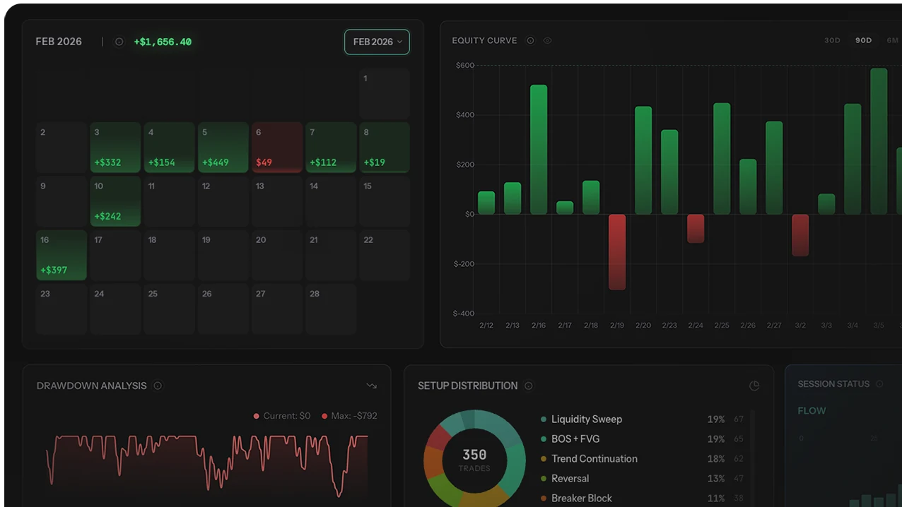
The calendar rendered each day as a colored cell — green shades for profitable days, red for losing days, intensity based on P&L magnitude. Monday through Thursday were mostly green. Fridays were almost entirely red.
Out of the last 12 Fridays: 10 were losing days. The two profitable Fridays had gains of $45 and $80 — barely positive. The Friday column wasn't just statistically unprofitable; it was visibly a stripe of red cutting through an otherwise green calendar.
Why Visual Data Beats Numerical Data
The human brain processes visual patterns in 13 milliseconds. Numerical patterns require conscious arithmetic — comparing values, mentally categorizing outcomes, remembering averages. In a spreadsheet, 180 trades across 3 months means ~180 cells of numbers that the brain can't parse as a pattern without sorting, filtering, and grouping.
In a heatmap, 60 days of trading render as a grid where color encodes outcome. The brain's pattern recognition fires before rational analysis starts. That's why Marcus saw "something wrong with Fridays" in seconds — it wasn't analysis, it was perception.
The Numbers Behind the Pattern
Marcus pulled the underlying data to quantify what the heatmap revealed visually:
| Day of Week | Avg Daily P&L | Win Rate | Avg Trades/Day | Monthly Total |
|---|---|---|---|---|
| Monday | +$145 | 56% | 3.2 | +$580 |
| Tuesday | +$210 | 58% | 3.8 | +$840 |
| Wednesday | +$185 | 55% | 3.5 | +$740 |
| Thursday | +$160 | 54% | 3.4 | +$640 |
| Friday | -$600 | 38% | 4.5 | -$2,400 |
The data told a striking story. Mon-Thu averaged $175/day profit with a 56% win rate. Fridays averaged $600/day in losses with a 38% win rate — and notably, Marcus took more trades on Fridays (4.5 vs 3.5 average).
The total: Mon-Thu generated +$2,800/month. Fridays drained -$2,400/month. Without Fridays, his monthly profit would have been $3,600. With Fridays, it was $1,200. One day per week was cutting his income by 67%.
Why Fridays Were Different
Marcus reviewed his Friday trades individually and found three structural reasons — not one.
1. Lower Liquidity and Wider Spreads
Friday afternoons (especially after the London close) have noticeably less liquidity. Major institutional desks wind down early; weekend-risk positioning reduces activity. Spreads widen, order books thin, and price action becomes choppy. Marcus's strategy relied on clean support/resistance bounces that work in liquid conditions but fail in thin markets. The tool was right; the environment wasn't.
2. Overtrading to Close the Week Positive
Marcus noticed he took 4.5 trades on Fridays versus 3.5 on other days. The extra trade was almost always a forced entry late in the session, taken because he wanted to end the week on a positive note. These end-of-week forced trades had a 22% win rate. The psychological need to "finish strong" was overriding the setup-quality filter that worked Monday through Thursday.
3. Institutional Position-Squaring
Friday price action often includes institutional profit-taking and position-squaring before the weekend. This creates false signals — a support bounce that reverses 20 pips later when the next batch of position-squaring hits. Marcus's strategy read these as valid setups. In reality they were noise from flow that had nothing to do with directional intent.
The lesson: Marcus didn't have a bad strategy — he had a strategy that didn't work in Friday conditions. The same entries that won 56% of the time Mon-Thu won only 38% on Fridays. The market context changed. His approach didn't.
The Fix: One Rule, Measurable Results
Marcus added one rule to his trading plan: no trading on Fridays. Fridays became dedicated to trade review, weekly journal analysis, and strategy preparation for the following week.
The 3-Month Results
| Period | Monthly Avg P&L | Trading Days/Month | Win Rate | Expectancy/Trade |
|---|---|---|---|---|
| Before (Mon-Fri) | $1,200 | 22 | 52% | $8.40 |
| After (Mon-Thu) | $3,400 | 17 | 56% | $19.80 |
| Improvement | +$2,200/mo | -5 days | +4pp | +136% |
Why the Win Rate Improved
Win rate moved from 52% to 56% — not because Marcus became a better trader, but because the low-quality Friday trades (38% win rate) were no longer dragging the overall statistic down. Expectancy per trade jumped from $8.40 to $19.80, a 136% increase. Every remaining trade was in conditions his strategy was designed for.
The Time Dividend
Marcus traded 5 fewer days per month — 60 fewer trading days per year. Those hours converted into preparation, review, and personal time. Trading less produced more money and more life. That's unusual in trading; it's often the signature of removing a structural leak rather than optimizing what's already working.
Calendar heatmap analysis is nearly impossible to do rigorously in Excel — rendering a colored grid from daily P&L requires conditional formatting setup, and cross-tab analysis (day-of-week × volatility regime × setup type) needs pivot tables that break when the data shape changes. Modern trading journals render calendar heatmaps natively and link cells back to the underlying trades with one click. The journal comparison guide covers which ones have this visualization built in.
3 Mistakes Traders Make With Heatmap Analysis
Mistake 1: Acting on 8-12 Data Points
Three months gives you ~12 Fridays. That's barely enough data to distinguish signal from noise. A day-of-week verdict based on 12 occurrences is prone to the confounder problem (NFP clustering, holiday weeks, specific macro events). Before eliminating a day entirely, require at least 20 occurrences with a consistent pattern. If 20 Fridays show the same ~38% win rate, the signal is real. If only 12 do, wait for more data.
Mistake 2: Eliminating Instead of Adjusting
"No Friday trading" works because it's mechanical. But it also throws away potential profit if Friday edge exists under specific conditions (low-volume, range-bound, no major news). A more nuanced fix: reduce position size 50% on Fridays, or require an extra quality gate, or trade only specific setups. Elimination is the blunt fix; adjustment is the sophisticated one. Start with elimination to confirm the pattern matters, then refine.
Mistake 3: Treating Heatmap Patterns as Universal
Marcus's Friday problem came from his specific strategy meeting specific Friday market conditions. Another trader running momentum breakouts on Fridays might thrive — exactly because of the wider spreads and higher-impact news. Heatmap patterns are strategy-specific. Copying Marcus's "no Friday" rule without running your own heatmap first applies a fix to a problem you may not have.
What Heatmaps Reveal (Beyond Day of Week)
Marcus's Friday pattern is one example. Calendar heatmaps reveal several pattern types that are hard to see in raw data:
- Day-of-week performance. Some traders lose on Mondays (post-weekend gap risk, stale positioning). Others lose on Wednesdays (FOMC days). The heatmap shows which specific day is your worst.
- Week-of-month patterns. Traders often behave differently in the first week (fresh, aggressive) versus the last week (chasing monthly goals, getting reckless). Color patterns across the month expose this tendency.
- News event clustering. Major economic releases (NFP, CPI, FOMC) create red clusters on specific dates. If the heatmap shows consistent red around these events, the fix is event-specific, not day-specific.
- Seasonal patterns. Summer months often show lighter colors (lower volatility, fewer opportunities). December typically shows reduced activity. These macro patterns inform the annual trading plan.
- Post-loss streaks. A common pattern: after a losing day, the next day is often worse. The heatmap makes this visible as red-red-red sequences. The fix: mandatory reduced-size trading after consecutive losing days.
Who Should Skip Heatmap Analysis
Calendar heatmap analysis isn't universally applicable. Specific trader profiles get limited value — or distortion — from this visualization:
- Low-frequency traders (<3 trades/week). Heatmaps need daily trade density to reveal patterns. A swing trader with 2-3 trades per week per month has too many blank cells for visual pattern detection to work.
- Traders with fewer than 100 total trades. Statistical significance requires volume. Below 100 trades, any "pattern" visible in the heatmap is probably noise — plausible-looking clusters that disappear in the next sample.
- Strategy-switching traders. If you run 3 different strategies across different days (news on Monday, breakout on Tuesday, reversion on Thursday), heatmap patterns get confounded by which strategy was active when. Separate heatmaps per strategy are required.
- Fully-mechanical systematic traders. If a system runs autonomously without discretion, heatmap patterns reveal market behavior rather than trader behavior. The intervention isn't "skip Fridays" — it's retuning the system, which is a different project.
- Traders without volatility/regime tagging. Day-of-week patterns often hide regime patterns. Without tagging trades by volatility regime (high/low VIX, trending/ranging), you'll misdiagnose regime problems as day-of-week problems.
How to Find Your Hidden Pattern (5 Steps)
Replicate the analysis:
- Get at least 3-6 months of trade data into a journal with calendar heatmap rendering. Excel works with conditional formatting, but purpose-built journals render it cleaner. More data beats less — aim for 6 months if available.
- Look at the calendar for 10 seconds before analyzing. Don't count — just look. Are there color patterns by day of week? By week of month? By specific date clusters? Visual perception before rational analysis is the point.
- Quantify the pattern you see. If one day looks consistently red, pull numbers: average P&L, win rate, trade count, expectancy per trade. Compare to other days. Require at least 20 occurrences before treating the pattern as confirmed.
- Check for confounders. Does the red cluster align with news events? With volatility regimes? With post-loss streaks? The apparent cause may be a correlated variable — rule out confounders before acting.
- Test the hypothesis with a controlled change. Modify your plan for one month (remove the bad day, reduce size, adjust for conditions). Compare results to the previous month. If removing or modifying the pattern improves results, keep the change. If not, the original pattern was noise.
The entire process takes ~30 minutes of analysis plus one month of testing. The potential improvement — as Marcus discovered — can be transformative. Your heatmap may not show a Friday problem. It might show a Monday problem, a first-week-of-month problem, or a news-day problem. The specific pattern doesn't matter. What matters is that you look.
Final Verdict: Visualizations Reveal What Spreadsheets Hide
Marcus's leak wasn't invisible because his data was incomplete. It was invisible because rows of numbers don't render as patterns to the human brain the way colored grids do. The heatmap didn't discover new information — it made existing information perceivable. That's the entire case for visualization over raw data in trading analysis.
The $2,400/month improvement came from one observation, one rule, and roughly 30 minutes of analysis. The rule itself wasn't clever — "don't trade Fridays" is a coin-flip-simple hypothesis. What was clever was running the visualization that made the hypothesis visible in the first place.
Three principles from this case study:
- Spreadsheets hide patterns that visualizations expose. The data was always there; the perception wasn't.
- Sample size matters more than pattern strength. 12 Fridays is too few; 20+ is where confidence starts.
- Correlation is not causation — rule out confounders before acting. Days of week often hide news-event, volatility, or fatigue patterns. Diagnose the real driver.
For related data-driven pattern discoveries, see the session filter case study (time-of-day edge analysis) and the revenge trading case study (behavioral trigger analysis). Each uses the same core principle: make the invisible visible, then act on what you see.