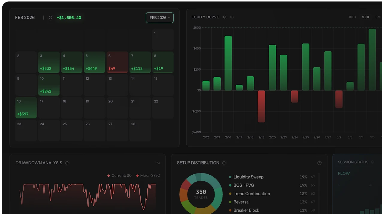
One chart reveals more than any single performance metric: your total equity curve overlaid against a filtered subset of your best trades. The gap between the two lines is the exact dollar cost of every trade you should not have taken — measured in your own data, not in theory. For most multi-setup retail traders, this gap is 50-200% of total P/L: a trader showing $400 net P/L from 120 trades typically has a filtered curve at $1,500-2,000 from their best 30-50 trades. The "extra" 70-90 trades didn't diversify performance — they diluted edge by an average of 60-80%.
This guide covers the comparison technique mechanics (how to construct the overlay), what specifically fills the gap between curves and why each component exists, the per-filter-dimension breakdown (setup, session, day-of-week, direction, instrument, quality grade), the survivorship-bias trap that inflates results when filters are discovered after seeing data, the action plan for converting visual insight into permanent trading rule changes, and the psychological resistance most traders experience when the data tells them to do less rather than more.
Equity curve overlay technique is standard practice in trading-system performance analysis and references the broader portfolio performance literature. Recovery factor metric used in comparison interpretation is conceptually equivalent to the Calmar ratio from hedge-fund performance analysis. Specific dollar figures and filter-gap percentages illustrate typical patterns observed in aggregated journal data; individual trader results vary substantially based on number of setups, sample size, and strategy stability.
The most powerful chart in trading analytics: Two equity curves on one screen — gray (all trades) vs green (your best filter). The gap between them is the exact dollar cost of every trade you should never have taken, encoded into a single visual that tabular metrics can't replicate.
The Concept in 60 Seconds
You took 120 trades last month. Your account went from $10,000 to $10,400 — up $400. Not bad, but nothing life-changing.
The Filter Reveals the Hidden Performance
Now filter those 120 trades to only your BOS+FVG setup during London session. 45 trades. Those 45 trades made $1,800. The other 75 trades lost $1,400 in aggregate. Your "diversified" approach didn't diversify your returns — it diluted your edge. The 75 marginal trades turned a $1,800 month into a $400 month.
Why the Visual Beats the Math
Tabular comparison ($1,800 vs $400) is informative. The visual comparison is transformative. The green line (45 trades) climbs smoothly across the month. The gray line (120 trades) starts identical, then every time a bad trade happens, it dips while the green line continues smoothly. By month-end, the gap between lines is visually undeniable in a way that comparing two numbers in a table never matches. This is why most traders who finally cut their bad setups do so after seeing the overlay, not after reading the metrics.
What the Gap Between Curves Reveals
The gap between your total curve and filtered curve is made up of specific trade categories. The typical breakdown:
Gap Composition Across Observational Data
| Trade Type | % of Gap (typical) | Why It Exists |
|---|---|---|
| Revenge trades after losses | 25-35% | Emotional, unplanned, taken to "make back" money |
| Boredom / FOMO trades | 20-25% | No actual setup — just wanted to be in a position |
| B/C-grade setups | 20-30% | Setup existed but conviction was low — taken out of habit |
| Wrong-session trades | 10-15% | Trading during hours when your strategy doesn't work |
| Experimental trades | 5-10% | Testing a new idea with real money instead of demo |
Why Each Category Is Fixable
Every one of these categories is fixable — not by finding better strategies, but by enforcing better discipline about when and what to trade. The structural insight: most retail trader underperformance isn't strategy-deficient; it's discipline-deficient. The setups that work are clear in the data; the trader's edge is being diluted by additional activity that doesn't share the working setup's profile.
How to Run the Comparison (Step-by-Step)
Step 1: Get Your Setup Breakdown
Before comparing curves, identify which setup is your best. Pull a breakdown table showing profit factor and trade count by setup:
| Setup | Trades | Win Rate | Profit Factor | Total P/L |
|---|---|---|---|---|
| BOS + FVG (London) | 45 | 58% | 2.1 | +$1,800 |
| Range breakout | 28 | 46% | 1.1 | +$120 |
| News reaction | 15 | 40% | 0.8 | −$180 |
| "Felt right" / no tag | 32 | 38% | 0.6 | −$1,340 |
The data is unambiguous: BOS+FVG generates all the profit. Range breakout is marginal. Everything else is negative. The 32 untagged "felt right" trades alone lost $1,340.
Step 2: Generate Both Curves
Plot two equity curves on the same chart:
- Gray line: All 120 trades, in chronological order
- Green line: Only the 45 BOS+FVG trades, in chronological order
Both curves start at the same point. The green line includes only filtered trades; days where you took only non-filtered trades show as flat segments on the green line and as movements (usually downward) on the gray line.
Step 3: Read the Gap
The visual tells the story instantly. The green line climbs consistently. The gray line starts the same, then every time a bad trade happens, it dips while the green line continues. Over 120 trades, the gap grows progressively wider. By month-end: green = +$1,800, gray = +$400. The $1,400 gap is the total cost of trades you didn't need to take.
Step 4: Quantify the Improvement
| Metric | All Trades | Best Setup Only | Improvement |
|---|---|---|---|
| Total P/L | +$400 | +$1,800 | +350% |
| Profit factor | 1.12 | 2.10 | +88% |
| Win rate | 47% | 58% | +11 pp |
| Max drawdown | −$820 | −$340 | −59% |
| Trades per month | 120 | 45 | −63% |
Fewer trades, more money, less drawdown, better sleep. The math doesn't require sophistication — it requires willingness to look at the data and act on it. See impact analysis for the quantitative version of this same comparison technique.
Beyond Setups: Other Filter Dimensions to Compare
The setup filter is the most common, but the comparison applies to any dimension. Run multiple comparisons across these dimensions to identify the highest-impact filter for your specific data:
By Session
Total curve vs "London session only" or "London-NY overlap only." If one session dominates P/L, the comparison shows the cost of trading other sessions. See session performance comparison for the per-session expectancy framework that informs this filter.
By Day of Week
Total curve vs "Tuesday-Wednesday-Thursday only" curve. If Friday kills your P/L or Monday morning compounds losses, the day-of-week comparison makes the schedule problem visually undeniable. The mid-week subset frequently shows 30-100% better P/L than the full-week curve.
By Direction
Total curve vs "long trades only" or "short trades only." Many retail traders have strong directional bias — great at buying dips but terrible at shorting tops, or vice versa. The curve comparison exposes the asymmetry that aggregate metrics smooth over.
By Instrument
Total curve vs "EUR/USD only" or "ES futures only." If you trade 5 pairs but one generates 80% of profit, the other 4 might be dead weight. Cross pairs frequently show as instrument-level dilution for traders better suited to majors.
By Trade Quality Tag (A/B/C Grading)
If you grade entries with quality tags — total curve vs A-trades only. This is often the most diagnostic comparison because trade-quality grading captures the discipline dimension that other filters miss. See trade quality vs P/L analysis for the grading framework. If A-trades produce a staircase curve and B/C-trades produce decline, the message is clear: stop taking below-A-grade.
Multi-Dimensional Filters
The five filters can be combined: "What if I only took A-grade BOS+FVG setups during London Open Tuesday-Thursday?" Multi-dimensional filtering frequently reveals the trader's actual high-edge subset hidden within a much larger noisy dataset. Six-dimension filters (setup × quality × session × day × direction × instrument) often produce filtered curves 200-400% better than total curves — at the cost of trade frequency dropping by 80-90%.
Multi-dimensional curve overlay analysis is one of the most leveraged routine analyses in retail trading. Manual construction in spreadsheets makes 5-dimensional filtering slow and error-prone; automated journals with built-in equity curve overlay produce comparisons across all filter dimensions in seconds, with rolling-window updates as new trades come in. The trading journal comparison covers which journals support multi-dimensional curve overlays. The equity curve foundational guide covers reading mechanics, the curve shape diagnosis covers shape interpretation, and the impact analysis covers the quantitative simulation of filter-cut effects.
The Hard Part: Actually Cutting the Trades
Seeing the data is easy. Acting on it is hard. Five resistance patterns most traders experience after running the comparison:
Resistance 1: "But what if that B-setup turns into a winner?"
It might. But on average, across 30+ instances, it doesn't. One lucky B-trade doesn't justify 29 losing ones. The probability framework matters more than any individual trade's outcome — the filter exists precisely because the aggregate is negative, even though specific instances can be positive.
Resistance 2: "I'll be bored sitting out."
Boredom is a feature, not a bug. The best traders spend most of their screen time waiting, not trading. Boredom signals that you're not forcing trades — which is the discipline the filter is designed to enforce. The action of sitting through a boring market without trading is what produces the filtered curve's smoothness.
Resistance 3: "I need the practice."
Practice on demo for C-grade setups. Practice on real money only for A-grade setups. Your live account isn't a training facility — it's the production environment where edge gets compounded or destroyed. Testing happens elsewhere.
Resistance 4: "What if I'm wrong about which setup is best?"
You're not guessing. The data says BOS+FVG has profit factor 2.1 over 45 trades — that's not opinion, it's measurement from your own journal. The risk isn't being wrong about the best setup; the risk is being wrong about whether 45 trades is enough sample to commit to it (it usually is at 50+ trades).
Resistance 5: "I'll lose if I take fewer trades because I need volume."
Volume doesn't create edge — it amplifies whatever edge or anti-edge already exists. If your filtered curve is +$1,800 from 45 trades and the additional 75 trades subtract $1,400, more volume of those 75 makes it worse, not better. Trade frequency is appropriate when each additional trade has positive expected value, not when total trades pad an arbitrary daily count.
3 Mistakes Traders Make With Curve Comparison
Mistake 1: Running Comparison Below Sample Threshold
A filter producing 12 trades over 30 days isn't a comparison — it's an anecdote. Below 30 trades per filter, normal variance can produce flattering or unflattering gaps regardless of underlying edge. Wait for filter sub-samples of 30+ trades before drawing conclusions. The total dataset should be 100+ trades to support meaningful sub-filter analysis.
Mistake 2: Using the Comparison to Find Filters Rather Than Confirm Them
The right workflow: pre-declare which filters you trade (BOS+FVG setup, London session, A-grade only), then run the comparison to confirm they're working as expected. The wrong workflow: run comparisons on every possible filter dimension, find the one with the biggest gap, declare that the strategy. The first is hypothesis-confirming; the second is data-mining. Only the first generalizes forward.
Mistake 3: Cutting Too Aggressively After First Comparison
Going from 120 trades/month to 45 trades/month is a 63% reduction in trading activity. The psychological adjustment to that reduction is significant — boredom, missed-opportunity FOMO, and the urge to "compensate" by adding new untested setups. Phase the cut: reduce by 50% in month 1, evaluate, reduce further if filtered performance holds. Cutting too aggressively in one step often produces compensating overtrading on remaining filters that erodes the gain.
Who Should Skip Curve Comparison (For Now)
- Traders with fewer than 100 total trades. Sub-filter samples will be too small (typically 20-30 per filter) for meaningful comparison. Wait until 200+ total trades before running multi-filter comparisons.
- Single-setup traders. If you only trade one setup, the comparison hack reduces to "all my trades vs all my trades on that setup" — which is the same curve. Apply edge measurement instead, which is the appropriate framework for single-setup traders.
- Traders without consistent trade tagging. The comparison requires every trade tagged with setup, session, and other filter dimensions. Untagged trade history produces "unknown" buckets that distort filter results. Tag retroactively from journal notes or commit to forward tagging for 60-90 days before running comparison.
- Algorithmic traders. Systematic strategies typically don't have the discretionary categorical filters that comparison analysis targets. Different methodology applies — backtesting, walk-forward analysis, regime-aware metrics rather than filtered-curve overlays.
- Traders mid-strategy-transition. If you've changed entry rules, position sizing, or instruments in the last 30 days, your trade history blends two different strategies. Filter results become uninterpretable because filters span the strategy-change boundary. Stabilize first; analyze second.
The Comparison Hack Action Plan
- This week: Run a setup breakdown on your last 60+ trades. Identify your top 1-2 setups by profit factor (≥1.5 over 30+ trades each).
- This weekend: Generate the equity curve comparison — total trades vs your top setup. Visualize the gap.
- Run additional filter comparisons: session-only, day-of-week-only, A-grade-only. Note which produces the biggest gap.
- Next month commitment: Trade only your top 1-2 setups, only during best-session window, only at A-grade quality. Zero tolerance for untagged or low-conviction trades.
- Phase the cut: If current cuts feel too aggressive, reduce by 50% rather than 75%. Evaluate after 30 days; deepen the cut if filtered performance holds.
- Month-end review: Re-run the comparison on the new month's data. Is the new total curve approaching the previous filtered curve? That's the success metric.
Methodology Note
- Comparison technique: Standard methodology in trading-system performance analysis. Total curve plotted from full trade set; filtered curve plotted from sub-set defined by pre-declared filter category.
- Sample size requirements: Minimum 30 trades per filter for moderate-confidence comparison, 50+ for high confidence. Total dataset of 100+ trades to support meaningful sub-filter analysis.
- Pre-declared filter discipline: Filter categories must be definable in advance — setups defined in trading plan, sessions defined by clock time, quality grades assigned at trade entry. Post-hoc filter discovery produces survivorship-bias inflated results that don't generalize forward.
- Multiple comparison bias: Running comparisons on many filter dimensions and reporting only the most flattering result is statistical cherry-picking. Pre-declare candidates; report all results, not just successful ones.
- Forward applicability: Comparison results correlate with forward performance for stable strategies on consistent market regimes. Strategy changes or regime shifts can invalidate previously-favorable filters; re-run quarterly.
For our full editorial process, see our editorial methodology.
Final Verdict: Subtraction Beats Optimization
The equity curve comparison hack reveals a structural insight most retail traders need but resist: performance improvement comes more often from subtracting bad activity than from finding new strategies. The filtered curve represents what your trading would look like with discipline applied to filter selection — usually 50-200% better than the unfiltered total curve. Closing the gap doesn't require new skills, new indicators, or new strategies; it requires the discipline to stop doing the activity that's already known to be unprofitable.
The methodology has two non-negotiable requirements: filters must be pre-declared (definable in trading plan in advance, not discovered through data mining), and sub-filter samples must meet minimum 30-trade thresholds. Without these disciplines, the comparison produces survivorship-bias inflated results that fail to reproduce forward.
Three principles from the framework:
- The visual beats the math. Two curves on one chart communicate what tabular metrics cannot. Most traders only commit to discipline changes after seeing the overlay, not after reading the numbers.
- Pre-declared filters generalize forward; discovered filters don't. Run the comparison on filter categories your trading plan can implement, not on ad-hoc data slices.
- Subtraction beats optimization. Closing the gap between total and filtered curves is higher leverage than searching for new strategies. The edge already exists; the discipline is what's missing.
For related analysis: equity curve foundational guide for reading mechanics and the 5-shape framework, equity curve shape diagnosis for the 7-shape diagnostic-and-prescription matrix, impact analysis for the quantitative version of filter-cut simulation, trade quality vs P/L for the grade-based filter dimension, session performance comparison for the time-of-day filter dimension, and Friday P/L analysis for the day-of-week filter dimension.