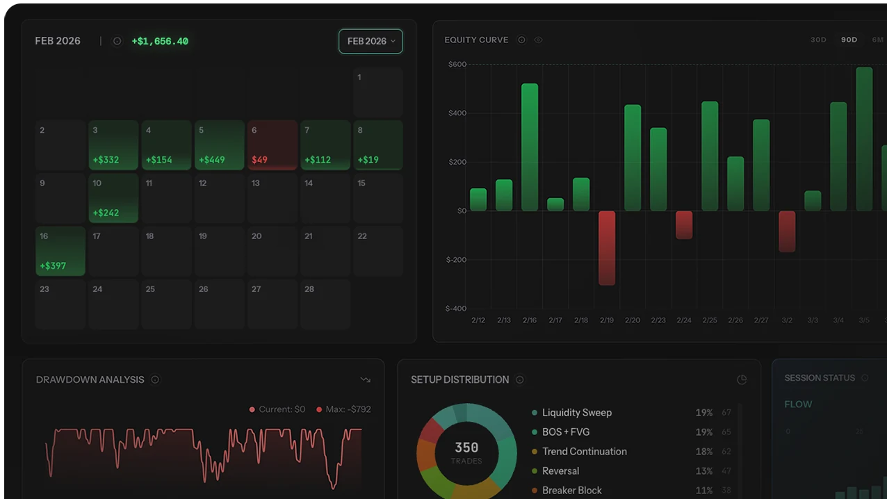
Your equity curve is the single most honest picture of your trading performance. Win rate can be faked by cutting winners short. P/L can be skewed by one lucky trade. Profit factor can be inflated by selecting favorable time windows. The equity curve cannot be faked because it shows every trade in sequence — every drawdown, every recovery, every regime shift, encoded into the shape of the line. Reading the shape correctly is one of the highest-leverage diagnostic skills a trader can develop, because it surfaces problems (sizing inflation, edge decay, tilt spirals) that single-metric analysis hides.
This guide covers what an equity curve actually plots and why shape matters more than direction, the five canonical curve shapes (Staircase, Volatile Climber, Flatline, Avalanche, Spike-and-Crash) with specific diagnostic and prescription for each, drawdown depth/duration/recovery patterns visible only in curve shape, the filtered-vs-total curve overlay technique that reveals exactly how much your worst trades are costing you, and the curve-reading habit that converts the visualization into a monthly performance audit.
Equity curve interpretation framework references standard practice in trading-system analysis and portfolio performance literature. Recovery factor metric (Net Profit ÷ Max Drawdown) is conceptually equivalent to the Calmar ratio from hedge-fund performance analysis. Curve shape categories reflect aggregated patterns observed across active retail traders in the TSB journal user base; individual results vary substantially based on strategy, sample size, and market regime.
Why shape matters more than direction: Two traders with the same final P/L can have completely different forward-looking outlooks. Trader A's $5,000 profit came from a smooth staircase — likely sustainable. Trader B's $5,000 came from a volatile spike that gave back 40% before recovering — likely unsustainable. The aggregate dollar number is identical; the curve shape predicts very different forward outcomes.
What an Equity Curve Actually Shows
An equity curve plots cumulative P/L over time. Each point represents total profit or loss after N trades (or N days). The line goes up when you're making money and down when you're losing. Mechanical and simple — but the diagnostic value lives in the shape of the line, not any specific point on it.
Five Information Layers Encoded in Shape
- Direction. Up = positive expectancy in the measured window. Down = negative. Flat = break-even. The headline metric, but the least informative individually.
- Smoothness. Smooth curve = consistent edge with stable execution. Jagged curve = inconsistent risk, sizing variance, or strategy drift.
- Pullback depth. Shallow dips = good risk management. Deep dips = position sizing too aggressive or psychological response to losses creating compounding.
- Recovery speed. Quick bounce-backs (V-shape) = resilient strategy with intact edge. Slow recoveries (U or L-shape) = edge is thin or confidence is shaken from drawdown.
- Trend changes. A curve climbing for months that starts flattening = market regime changed, edge is decaying, or discipline is slipping. The transition point in the curve is more diagnostic than any single drawdown.
Why It Can't Be Faked
Single-metric reports allow selective framing — pick a favorable window, cut losing trades from analysis, focus on win rate while hiding profit factor. The equity curve resists all of these because it includes everything in chronological order. The bad weeks are visible. The drawdown clusters are visible. The regime shifts are visible. This is why professional fund evaluators look at curves first and metrics second — curves expose the framing tricks that metric tables enable.
The Five Equity Curve Shapes (And What They Mean)
Shape 1: The Staircase ✅
Steady upward steps with short flat consolidation periods between climbs. Each step represents a winning cluster; each flat period is normal variance. No deep drawdowns — pullbacks contained to under 5% of equity.
What it tells you: Consistent edge, controlled risk, disciplined execution. The strategy works, position sizing is appropriate, and emotional response to drawdowns isn't compounding losses. This is the target shape every trader should aim for.
Action: Protect the shape. Don't increase risk dramatically, don't add untested strategies, don't change what's working. Scale position size only after 3+ months of stable staircase behavior, and scale gradually (10-20% size increases, not 50-100%).
Risk: Complacency. Staircase curves can lull traders into overconfidence — "I can't lose, I should size up." The moment sizing inflates beyond what produced the staircase, the curve transitions to volatile climber or worse. Lock in the discipline that produced the curve before considering scaling.
Shape 2: The Volatile Climber ⚠️
Trending upward overall, but with big swings — sharp rises followed by sharp pullbacks, then new highs. Net direction is positive, but path is rough. Drawdowns 5-15% of equity, recovery typically over 1-2 weeks.
What it tells you: You have an edge, but risk management is inconsistent. Either you're sizing up on certain trades, overtrading during certain periods, or the strategy has high natural variance (trend following with infrequent large wins, for example).
Fix: Standardize position sizing. If you risk 1% per trade Monday and 3% Thursday because you "feel confident," that inconsistency creates the volatility. Lock fixed risk per trade and the curve smooths without changing strategy. See win rate vs risk-reward for the math on how sizing variance amplifies into curve volatility.
Shape 3: The Flatline 😐
Hovering around zero — slightly up, slightly down, no clear direction. Net P/L oscillates within ±5% of starting balance over months. This is the break-even zone where most retail traders spend the majority of their time.
What it tells you: A marginal edge being eaten by commissions, slippage, or low-quality trades. Not bad enough to lose consistently, but not good enough to make real money. The most fixable shape because the underlying edge often exists — it's just being diluted.
Fix: Filter trades by setup. Usually 2-3 setup types are positive and the rest are negative or neutral. Cut the negative setups via impact analysis and the flatline becomes a staircase. Check edge measurement by setup to find the divide between profitable and unprofitable categories.
Shape 4: The Avalanche 🔴
Started okay (flat or slightly up), then began declining and accelerated downward. Drawdowns deepen; recoveries fail to reach previous highs. Each new low is below the previous low. Often correlates with a specific external trigger — a market regime change, a personal life event, or a strategy modification that didn't work.
What it tells you: One of two things. (a) Your strategy had a temporary edge that decayed because market conditions shifted. (b) A single bad period triggered tilt that compounded into a behavioral spiral. The avalanche is the most dangerous shape because each losing day makes the next emotionally harder, creating exponential rather than linear damage.
Fix: Stop trading this strategy with real money immediately. Diagnose: did the market change (regime shift), or did you change (tilt, overtrading, rule-breaking)? If market — backtest the strategy on recent data to confirm degradation. If you — the fix is behavioral, not strategic. See revenge trading and overtrading guides. Resume only after diagnosis is complete.
Shape 5: The Spike-and-Crash 💀
Sharp upward move (a few big winning days), followed by sharp decline that gives most or all back. Repeats in cycles — up fast, down fast, net flat or negative. Equity oscillates 30-50% peak-to-trough repeatedly.
What it tells you: Gambling, not trading. Spikes come from oversized positions or leveraged bets that happen to work. Crashes come when the same approach doesn't. There's no underlying edge — only variance amplified by aggressive sizing. The shape persists across months because the trader keeps repeating the same pattern.
Fix: Fundamental reset. Reduce position sizes to 0.5-1% risk per trade. Force yourself to trade small for 30 days. If the curve is still spiky with small positions, the problem is strategy. If it smooths out, the problem was sizing — and you need to keep it small permanently. Most traders with spike-and-crash curves discover the underlying strategy is at or below break-even when measured at proper position size.
Reading Drawdowns on the Curve
A drawdown is any decline from a peak to a trough on your equity curve. Every trader has them — even the best. What matters is depth, duration, and recovery pattern.
Drawdown Health Diagnostic
| Drawdown Characteristic | Healthy | Warning | Critical |
|---|---|---|---|
| Depth (% from peak) | Under 5% | 5-10% | Above 10% |
| Duration (trading days) | 1-5 days | 5-15 days | 15+ days |
| Frequency per month | 1-2 small dips | 3-4 medium dips | Constant (curve never holds highs) |
| Recovery pattern | V-shape (quick) | U-shape (gradual) | L-shape (no recovery) |
The Recovery Factor Metric
The single most important drawdown metric is recovery factor = Net Profit ÷ Max Drawdown. A recovery factor of 3+ means you earn 3x what your worst drawdown was — that's a resilient strategy. Below 1.0 means worst drawdown exceeded total profit — fragile. The metric is conceptually equivalent to the Calmar ratio used in hedge-fund analysis but doesn't require return-annualization math.
For full drawdown analysis methodology, see the drawdown recovery framework covering recovery time math, the three drawdown zones with response protocols, and the psychological multiplier that extends real recovery beyond pure math prediction.
V-Shape vs U-Shape vs L-Shape Recovery
- V-shape recovery: Sharp drop, sharp recovery. Indicates a temporary variance dip with intact edge. Most healthy pattern.
- U-shape recovery: Drop, extended flat period, then gradual recovery. Indicates either market regime requiring patience, or psychological recovery from drawdown taking time. Workable but signals attention.
- L-shape pattern: Drop, no recovery. The trader either stops trading entirely or continues at reduced performance indefinitely. Indicates either edge has genuinely deteriorated or trader confidence is broken. Requires structural intervention, not just patience.
The Filtered-vs-Total Equity Curve Overlay
The most powerful equity curve analysis isn't reading one curve in isolation — it's overlaying two:
The Two-Curve Comparison
- Gray curve (total): All trades included — actual performance.
- Green curve (filtered): Only your best setup, best session, or best day-of-week — what performance would have been with your top-quality subset.
When you overlay these, the gap shows exactly how much your worst trades are costing you. If the green curve climbs smoothly while the gray curve is flat or declining, the difference is pure waste — trades that have no edge and dilute results.
The Question This Comparison Answers
"What would my equity look like if I only took my best trades?" The answer is usually shocking. Most multi-setup retail traders find their filtered curve (top 2-3 setups only) is 50-200% better than their total curve. The gap is made of revenge trades, boredom trades, FOMO entries, and setups they know are marginal but take anyway.
The Filter Dimensions to Test
- By setup type: overlay total vs (Trend Continuation + Pullback Entry only). Reveals setup-quality drag.
- By session: overlay total vs (London Open + NY Overlap only). Reveals timing-quality drag.
- By day of week: overlay total vs (Tuesday-Wednesday-Thursday only). Reveals day-of-week drag.
- By confidence/grade: overlay total vs (A-grade entries only). Reveals impulsive-trade drag.
- Multi-dimensional: overlay total vs (A-grade trend setups during London Open Tuesday-Thursday). Reveals the actual high-edge subset hidden in noise.
Building filtered-vs-total equity curve overlays manually is slow and error-prone. Spreadsheet-based curve analysis breaks down once you want to compare more than 1-2 filters or run rolling 90-day windows. Automated journals with built-in equity curve analytics produce overlay charts natively across all filter dimensions, plus rolling windows and regime-shift markers. The trading journal comparison covers which journals support multi-dimensional curve overlays. The performance analysis guide walks through running curve analysis, and the impact analysis guide covers the quantitative version of the filtered-curve question.
What to Do Based on Your Curve Shape
| Shape | Diagnosis | Action | Timeline to Improvement |
|---|---|---|---|
| Staircase | Edge + discipline | Protect. Don't change risk. Scale slowly. | Monitor monthly |
| Volatile climber | Edge + inconsistent risk | Fix position sizing — 1% per trade max | 2-4 weeks |
| Flatline | Marginal edge diluted by bad trades | Cut bottom 2-3 setups. Trade less. | 4-6 weeks |
| Avalanche | No edge or tilt spiral | Stop. Diagnose. Switch to demo if needed. | 1-2 weeks diagnosis, then rebuild |
| Spike-and-crash | Gambling with leverage | 0.5% risk for 30 days minimum | 30 days before re-evaluating |
3 Mistakes Traders Make Reading Equity Curves
Mistake 1: Looking Only at Direction, Ignoring Shape
"My curve is going up so I'm fine." But a volatile climber and a staircase both go up — and they have very different forward outlooks. The volatile climber's next drawdown is statistically larger than the staircase's. Direction tells you the past; shape tells you the forward distribution. Always evaluate shape characteristics (smoothness, drawdown depth, recovery pattern) alongside direction.
Mistake 2: Comparing Your Curve to Social Media Curves
Public curves on Twitter, Discord, and YouTube are heavily survivorship-biased — only the favorable curves get posted. Comparing your honest curve to the cherry-picked public curves produces misleading conclusions about your relative performance. The right comparison set is academic and observational data on the full retail trader population, where 10-20% are net profitable over 12+ months. Your flatline curve probably isn't evidence of failure; it's evidence of being above the population median.
Mistake 3: Reading the Curve Without the Filtered Overlay
Single-curve reading shows what is happening but not why. The filtered-vs-total overlay shows where the damage concentrates. A trader looking only at the total curve sees "I'm flat for 3 months" and concludes the strategy doesn't work. The filtered overlay would reveal that filtered curve (top setups + best sessions + Tuesday-Thursday) is +25% over the same period, and the dilution from worst categories is the actual problem. Always read both curves together.
Who Should Skip Equity Curve Analysis (For Now)
- Traders with fewer than 60 trading days of data. Curve shape is only meaningful with sample size — short curves can show any shape due to variance regardless of underlying strategy quality. Wait until 60-90 days of consistent trading before drawing curve-shape conclusions.
- Traders mid-strategy-transition. If you've changed entry rules, instruments, or sizing in the last 30 days, your curve blends two different strategies and shape is uninterpretable. Stabilize first; analyze second.
- Position traders / multi-week swing traders. Curves with 5-10 trades per month produce too few data points for shape analysis. The Calmar ratio and max drawdown are more diagnostic than visual curve interpretation at this trade frequency.
- Traders who haven't separated paper/sim trades from live. Mixing simulated and real-money trades in one curve produces uninterpretable shapes because the psychological component differs dramatically. Run separate curves; they'll tell different stories about the same strategy.
- Algorithmic traders. Systematic strategies' curves are dominated by market regime shifts, not by trader behavior. Different analysis framework applies — backtesting curves, walk-forward analysis, regime-aware metrics rather than the behavioral shapes described above.
Building the Equity Curve Reading Habit
Make curve analysis part of your workflow at four cadences:
- Weekly (10 seconds): Glance at the curve. Is it still trending up? Any sharp drop this week? No deeper analysis required — just the visual check.
- Monthly (10 minutes): Part of your monthly review. What shape did this month produce? Compare to last month. Did drawdowns shorten or lengthen? Did smoothness improve?
- Quarterly (30 minutes): Zoom out to 3-month view. Run the filtered-vs-total overlay. Is the gap widening (problem) or narrowing (improving)? What's the recovery factor trend?
- Before any strategy change (always): Look at the curve before deciding to change anything. Staircase = don't change. Volatile climber = fix sizing only. Flatline = filter setups. Avalanche = stop and diagnose. The curve dictates the right intervention.
Methodology Note
- Curve plotting: Cumulative net P/L (after costs) plotted by trade or by trading day. Pre-cost gross curves systematically overstate performance; net curves are the only valid diagnostic.
- Sample size: Curve shape requires 60+ trades minimum for moderate-confidence reading. 200+ trades for high-confidence shape categorization. Below 60 trades, normal variance can produce any shape regardless of underlying strategy.
- Drawdown thresholds: 5% / 10% boundaries are calibrated for personal accounts with 1% per trade baseline risk. Prop firm accounts with trailing drawdown require tighter thresholds (3-5% rather than 5-10%) — see drawdown recovery analysis.
- Recovery factor benchmarks: Above 3.0 indicates strong resilient strategy; 2.0-3.0 is acceptable; 1.0-2.0 is marginal; below 1.0 is fragile. Conceptually equivalent to Calmar ratio without return-annualization.
- Survivorship bias: Public curve examples are heavily biased toward favorable shapes. Compare against academic and observational data on full retail population, not against social media curves.
For our full editorial process, see our editorial methodology.
Final Verdict: The Curve Is the Truth
Your equity curve is your trading biography written in data. It can't be faked, can't be cherry-picked, and tells the truth about strategy quality, risk management, and discipline simultaneously. Five canonical shapes (Staircase, Volatile Climber, Flatline, Avalanche, Spike-and-Crash) cover almost every retail trader curve, each with specific diagnostic and prescription. Reading the shape correctly tells you which intervention applies — fixing volatile climber requires sizing discipline; fixing flatline requires setup filtering; fixing avalanche requires stopping and diagnosing.
The highest-leverage curve technique is the filtered-vs-total overlay — comparing your actual performance to what performance would have been with only your best subset. The gap between curves shows exactly where the damage concentrates and what the realistic upside looks like if you stopped doing the lower-quality activity. Most multi-setup traders discover their filtered curve is 50-200% better than their total curve, with the gap composed of trades they already knew were marginal.
Three principles from the framework:
- Shape predicts forward; direction describes past. Two curves with identical final P/L can have very different forward outlooks based on shape characteristics.
- Calibrate against the right reference set. Survivorship-biased social media curves overstate typical retail outcomes. The right comparison is academic and observational population data.
- The filtered overlay reveals the actual edge. Single-curve reading shows what is happening; overlaid curves show why and where to intervene.
For related analysis: drawdown recovery framework for the full math behind curve dips and the 3-zone response protocol, edge measurement for diagnosing whether curve direction matches underlying expectancy, impact analysis for the quantitative version of filtered-curve simulation, trade quality vs P/L for grade-based filter dimensions, trading statistics dataset for the population-level reference distribution, and performance analysis guide for running curve analysis on your own data.